How to Best Use 2023 Color Trends

By Kate Smith, Sensational Color.
Tips for utilizing 2023's upcoming color trends to create more expressive decorating.
Trends for 2023 have a common theme — people desire to be more expressive in their decorating choices, which you see in their design and color choices. Yet, putting a personal stamp on a home takes a good dose of confidence mixed with a bit of courage.
It is often easier to follow the latest trends than to create a unique scheme. Why not do both?
Here are three tips for using color trends to boost your confidence as you choose the colors for your next decorating, remodeling or new construction project and keep your scheme from looking outdated for years to come.
Tip 1 - You don't have to use the exact color
First, think of color trends like the menu at a favorite restaurant. Browse a color trend palette and choose colors as shown, or substitute similar hues that are lighter, brighter, darker or muted to fit your style. You may select items precisely as presented, or you can make changes so that an item suits your taste. For example, Sherwin-Williams Redend Point is a warm, earthy neutral. It is an intriguing color that may instantly attract you, but neutrals can be tricky. Redend Point has a pink undertone, which works beautifully with many colors, yet you may need one with a different undertone for your home. Use Redend Point as inspiration and find something similar, like Emerging Taupe or Velvety Chestnut, that better harmonizes with your scheme.
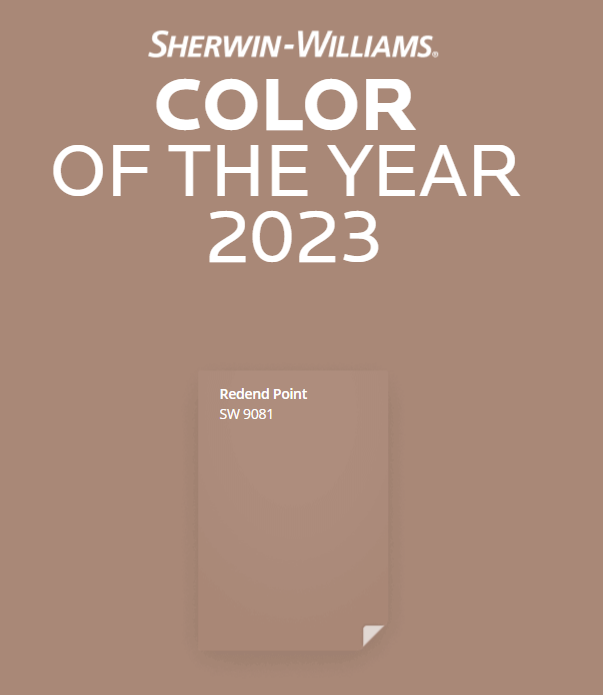
Sherwin-Williams' Redend Point
Tip 2 - Trends don't go out of style as quickly as you may think
Many people think that a color trend lasts about a year and that a particular color is no longer in fashion by the following year. That might be what many retailers would like you to think because it can boost sales, but it isn't true. Anything that comes into favor and disappears just as quickly is known as a fad — trends last a minimum of four to seven years.
Popular colors may shift warmer or cooler or become more or less intense in subsequent years, but they don't fall out of favor. For example, gray initially had a cool tone but now has shifted warm. Gray may not be the hottest hue for 2023, but it is still popular. Blue-green is another color that continues to attract our eye, and it comes to the forefront as Vining Ivy, the PPG Color of the Year. It is a deep, shaded, Caribbean aqua with a turquoise undertone that pairs perfectly with deep-toned woods for a home interior or exterior.
PPG's Vining Ivy
Tip 3 - Keep your colors from looking dated by avoiding these combinations
When a once-loved trend feels outdated, it is rarely because of the color but rather the combination. When people bring up past trends, they mention pairs of colors — avocado and gold, gray and mauve, or chocolate brown and aqua. At one time, these colors were everywhere. It isn't the colors that look outdated but the combination that puts a time stamp on the decor.
At one time, a combination of chocolate brown and aqua was so wildly popular that I called it "Choc-qua." Today when you see a room in this combination, you can guess when the homeowner last changed their decor. Had they paired Brown with a color other than aqua, or aqua with gold or navy blue, it would be harder to know when the scheme was created just by the colors alone. Keeping that in mind, the best way to use a trend color is to create a color scheme that differs from the way others use the colors, which is an excellent way to keep your colors from feeling either trendy or outdated. Use this as your opportunity to be more expressive in designing your space.
Whether going bold with Benjamin Moore's Raspberry Blush or Pantone's Viva Magenta (both pictured below) or understated with Behr's Blank Canvas (pictured above), always follow your instincts, and express yourself using colors that you love and those that look best for your home. That's that surefire way to always be in style.
Benjamin Moore's Raspberry Blush
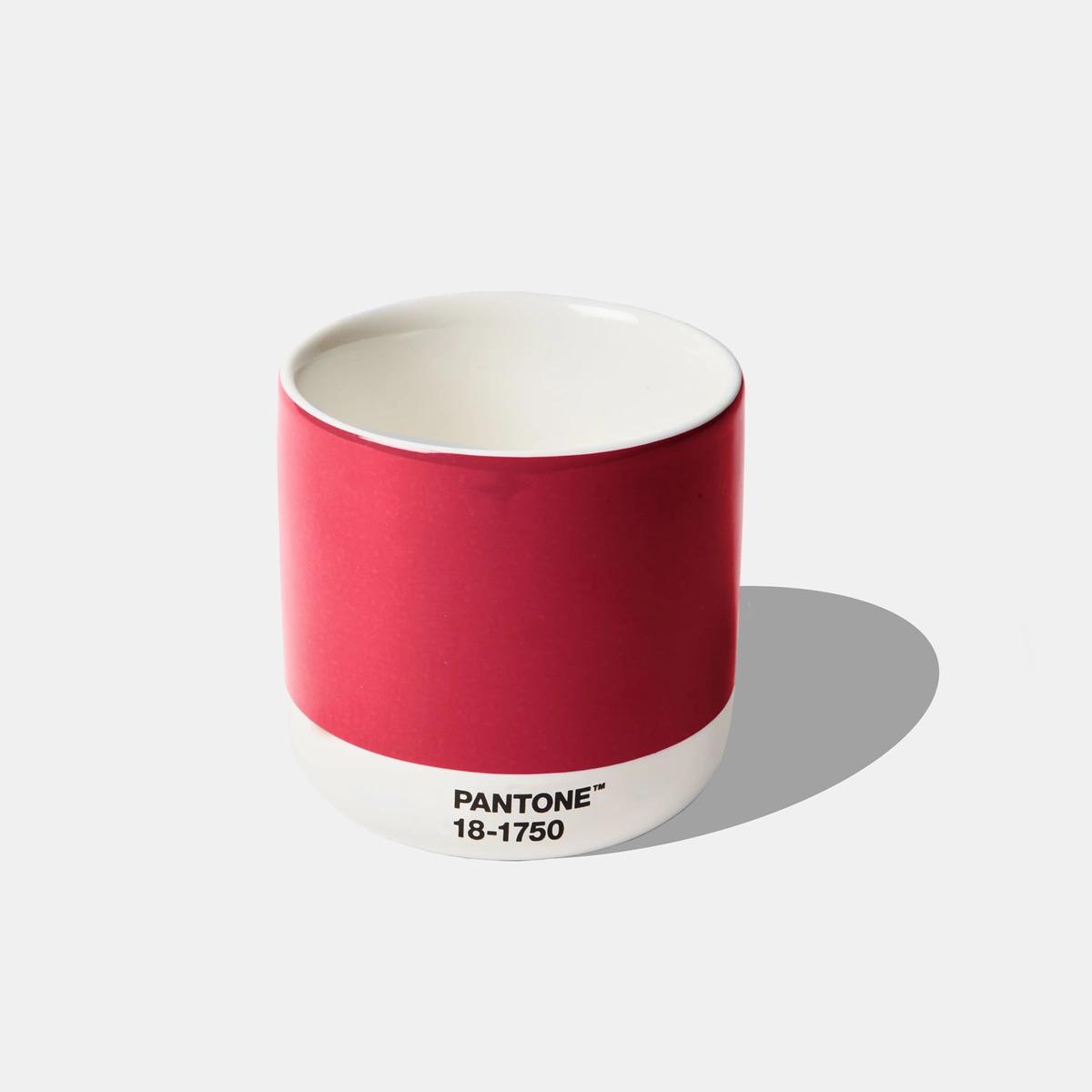
Pantone's Viva Magenta
Learn more about DaVinci Roofscapes.
Have a question? AskARoofer
Find your local roofing contractor in the RoofersCoffeeShop® Contractor Directory.
Recommended For You

The perfect blend of beauty and resilience
Read More ...
DaVinci® Roofscapes launches “FRESH Colors: Color Schemes for Your Home Exteriors” eBook for National Curb Appeal Month
Read More ...
Talk About a Roof in Ship Shape!
Read More ...")


")

Comments
Leave a Reply
Have an account? Login to leave a comment!
Sign In