What You Need to Know About Defining Colors on Your Home

By Kate Smith, Sensational Color.
Understanding the characteristics of color and how to choose the right color for your home.
We all think we know colors. From the time we pick up our first set of crayons, we’re mesmerized by the many shades and tones of colors. If it were only so easy to pick up jumbo crayons and color our home exteriors until we find the colors we think are just perfect!
Today I’m sharing a quick lesson in how to understand the characteristics of a color…and how choosing the right color can be easy for your home.
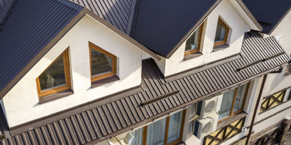
This home (pictured above) featuring DaVinci Multi-Width Slate has an exterior palette with colors, value and intensity that all work nicely together.
I've spoken with hundreds of homeowners in my work with DaVinci Roofscapes, They're all looking for the same thing. They want the color of their new composite shake or slate roof to complement the color of their home exterior. Here's the quick lesson I give them for creating a harmonious color scheme.
Think about color, value and intensity
To find the right color, first, define the three characteristics of the color you envision. You've expressed all three attributes if you describe the perfect color as light blue gray or deep olive green.
Let's break it down because when selecting a color, these three characteristics are what you are trying to get right. When choosing an exterior scheme, begin with the primary color you have in mind for your home. Is it neutral or a color? Light or dark? Is it toned down, a traditional color, or bright?
Start with the color family

Choose a color family or neutral — white, gray, black, off-white, beige or brown
The hues of the visual spectrum — red, orange, yellow, green, blue and violet along with the six intermediate colors -— red-orange, yellow-orange, blue-green, blue-violet, red-violet and neutrals are the color families. When you picture your home, is the primary color gray, white, blue or another color? Begin with a general idea of the color.

The same color from lighter to darker
Next, narrow the options by defining the value
Value describes the lightness or darkness of a color in terms of how close it is to white or black. The amount of light emanating from the color determines its value. For example, navy blue emits less light and has a lower value than pale sky blue, which reflects more light.
The texture of the material will also affect the amount of light reflected. Smooth finishes like metal or high-gloss paint reflect more light than textured surfaces like stucco.
To help you determine the value of different colors, most paint companies include the LRV (Light Reflectance Value) on the back of the color samples or an index for their entire line of paints. The higher the LRV of white or light colors means they reflect lots of the light that lands on them. Color with lower LRV reflects less light.
Some areas of the country specify that exterior colors be within a specific LRV range. In Tucson, Arizona, there are guidelines that builders must construct homes with materials that fall within a particular field of LRV to ensure a consistent earthy desert look throughout the town.
Guidelines for LRV are also often used to conserve energy consumption in a building. For example, if you want your home to absorb less heat in a hot climate, you would use a lighter (LRV of 50 or higher) and smoother finish. In cooler temperatures, a darker and more coarsely textured surface could serve to keep a home warmer.
Also, some materials have LRV recommendations. For example, most vinyl manufacturers recommend using an LRV of 55 or higher when painting PVC/Vinyl.
As you see, there can be more to think about when selecting the value of color than just how a color will look.

The same color from purer high intensity down to toned-down lower intensity
Lastly, find the right intensity
Intensity expresses the brightness or purity of a color. The closer colors are to the pure hue, the higher the intensity. High chroma colors are clear, pure, brilliant, bright, rich, bold or vivid. Less intense or saturated colors are toned-down, soft, muted, subtle, misty, dull, drab or dusty.
Intensity is the characteristic of color that trip people up most when it comes to finding a color that matches the idea of the color they have in mind. When we look at paint chips, we are naturally attracted to the color we think looks prettiest. Those colors, however, are rarely the ones we like best when painted on a home. The color that looked so pretty in the paint store may look too bright and much more colorful than what you had in mind once expanded to one or two stories.
If you were to look at a home painted in a color you love and then went to the store to find the actual color, I bet you'd be surprised at how much less colorful it is in the fan deck. That is because the color's full beauty isn't apparent when looking at that small sample, especially under artificial lighting. Once you see this less "colorful" paint on your home, it can come to life.
Colors like SW 7657 Tinsmith or SW 7015 Repose Gray might not jump off the paint chip racks at you, yet they may be just the color you need to enhance your cedar shake roofing or the stone around the entrance. SW 6215 Rocky River may not look like much when you see only a 2″ square but wait until you see how beautiful it looks on your shutters. I think you get the point.
The bottom line is that most of the time, the colors that will work best on your home exterior are not the ones you think look the prettiest on the swatches. The color you are looking for is far more likely to be one of the colors you passed over a first glance, thinking it was too dull. Slow down and give some of those more toned-down colors a second look. I bet the color you fall in love with on the exterior of your home will not be a color that first caught your attention.
- If you're looking for more color insights and curb appeal ideas, check out these stories on the DaVinci Roofscapes website: Best Exterior Color Scheme to Match Your DaVinci Roof
- Choosing House and Roof Color Combinations to Shake Up Curb Appeal
- Selecting Exterior Colors 101
Have a question? AskARoofer.
Find your local roofing contractor in the RoofersCoffeeShop® Contractor Directory.





Comments
Leave a Reply
Have an account? Login to leave a comment!
Sign In